Tag Archives: html5

LATEST APIs IN HTML5

Latest APIs in HTML5

Latest APIs in HTML5

The web is deriving at a fast pace. Every day a new framework, tools, and libraries are releasing with the ambition to become next jQuery. Here are some of the interesting HTML5 APIs, such as Navigation Timing API and Battery Status API. So, let’s dive deep in and know what are these about.

What is Navigation Timing API?

The Navigation Timing API provides data that can be used to measure the performance of a website. This API exposes several properties which offer information about the time at which certain events happen.

Navigation Timing API is W3C recommendation which means that its specifications will not be changed unless a new version is released. Unlike other JavaScript-based mechanisms that have been used for the same purpose, Navigation Timing API can provide end-to-end latency data that can be more useful and accurate.

Let us see an example of how you can measure perceived loading time:

function onLoad() {
var now = new Date().getTime();
var page_load_time = now – performance.timing.navigationStart;
console.log(“User-perceived page loading time: ” + page_load_time);
}

There are many measured events given in milliseconds that can be accessed through the Performance Timing interface. The list of events in order of occur rence is given below.

navigationStart: Is the time immediately after the browser finishes prompting to unload the previous document. If there is no previous document, then navigationStart is equal to fetchStart. This is the beginning of the page load time as perceived by the user.

unloadEventStart: unloadEventStart is the time immediately before the previous document’s unload event is fired. If there are no previous document, or if the previous document is from different origin then the value would be zero.

unloadEventEnd: If there are any redirects that point to a different origin then unloadEventStart and unloadEventEnd are both zero.

redirectStart: “redirectStart” represents the start time of the URL fetch that initiates a redirect.

redirectEnd: If there are any redirects then “redirectEnd” represents the time after the last byte of the last redirect response received.

requestStart: requestStart is the time before the browser sends a request for the URL.

responseStart: The time immediately after the browser receives the first byte of response.

responseEnd: The time immediately after the browser receives the last byte of the response.

In addition to the above set of properties, the Navigation Timing API also defines another object to determine how a user landed on a particular page. The object is called navigation and it belongs to windows.performance. It contains two properties i.e., “type” and “redirectCount”.

Type : This property provides the method by which the user navigated to the current page. The following are the list of values that “type” can hold.

⦁ If the user navigates to a page by typing the URL, clicking a link, submitting a form, or through a script operation, then the value of “type” is zero.
⦁ If the page is reloaded/refreshed, then the “type” is equal to one.
⦁ If the user navigates to a page by clicking back or forward buttons, then “type” is equal to two.
⦁ For other circumstances, “type” is equal to 255.

redirectCount: It is the number of redirects taken to the current page. If there are no redirects occurred or if any of the redirects are from a different origin, then the value is zero.

Browser Support: Browser support for this API is very good for both desktop and mobile. On a desktop, the Navigation Timing API can be implemented in Chrome, Firefox, Internet Explorer, and Opera. The only desktop browser that currently does not support this API is Safari. On mobile, the API can be implemented in iOS safari, UC browser, and Blackberry browser. Opera Mini is the only browser that does not support this API.

Battery Status API
What is Battery API?

The Battery Status API also referred as the Battery API, is an API that provides information about systems battery level. It also defines events that are fired when changes of the battery level or status take place. This can be used to adjust user’s applications resource usage to minimise battery drain when the battery is low or to save changes before the battery runs out in order to prevent data loss.

The Battery Status API exposes four read-only properties on the window.navigator.battery object, they are as follows:

strong>Charging: A Boolean value that specifies whether the battery is charging or not. If the device doesn’t have a battery or the value cannot be determined, then the value of this property is set to be true.

ChargingTime: A value that specifies the number of seconds remaining until the battery is fully charged. If the battery is already charged or the device doesn’t have a battery, then the property is set to be “0”. If the device is not getting charged or if it is unable to determine the remaining time, then the value is Infinity.

DischargeTime: The value that represents the number of seconds re maining until the battery is completely discharged. If the discharge time cannot be determined or the battery is currently charging, then the value is set to Infinity. If the device doesn’t have a battery, then the discharging Time is also set to Infinity.

Level: A value that specifies the current level of the battery. The value is returned as float ranging from 0 (discharged) to 1 (fully charged). If the level of the battery cannot be determined, the battery is fully charged, or the device does not have a battery, then the value of level is equal to 1.

Battery Status Events:
There are four events that can be fired by the battery object.

Chargingchange: The device has been changed to being charged to being discharged.

Levelchange: The level of the battery will be changed.

Chargingtimechange: It is the time until the battery is fully charged has changed.

strong>Dischargingtimechange: It is the time until the battery is fully discharged has changed.

Browser support

Browser support for the Battery Status API is pretty poor. Firefox is the only browser that provides support for the API without the use of vendor prefix.

WHICH WAY TO GO: NATIVE, HTML5, OR HYBRID?

Which way to go: Native, Html5, or Hybrid?

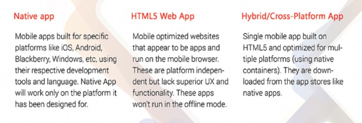
In a world that is progressively social and open, portable applications play a key role, and have changed the emphasis from what’s on the Web, to the applications on our smartphone. Versatile applications are no more an alternative, they’re a basic. You require a versatile application, yet where do you begin? Many elements have influence in your versatile technique, for example, your group’s improvement abilities, required gadget usefulness, the significance of security, logged off capacity, interoperability, and so on, that must be considered.

html

There are mainly 3 options of mobile application development:

mobile application developement
Native Mobile Applications

More or less, local applications give the best ease of use, the best elements, and the best general versatile experience. There are a few things you just get with local applications:

Multi touch – Twofold taps, squeeze spread, and other compound UI motions.

Graphics API – The local stage gives you the speediest design, which may not be a major ordeal in case you’re demonstrating a static screen with just a couple of components, or a major ordeal in case you’re utilizing a great deal of information and require a quick invigorate.

Fluid animation – Identified with the quick representation API is the capacity to have fluid liveliness. This is particularly vital in gaming, exceedingly intelligent reporting, or strong computational calculations for changing photographs and sounds.

Built-in components – The camera, location book, geolocation, and different elements local to the gadget can be consistently incorporated into versatile applications. Another imperative implicit parts is scrambled capacity, yet more about that later.

Usability – The local stage is the thing that individuals are acclimated to, thus when you include that recognition with the local’s majority highlights they expect, you have an application that is out and out simpler to utilize.

Documentation – There are more than 2500 books alone for iOS and Android advancement, with numerous more articles, blog entries, and nitty gritty specialized strings on destinations like StackOverflow.

HTML5 Web Apps

HTML5 is a dialect that empowers designers to make rich online applications that keep running on any gadget by means of the web program; engineers can “compose once, run all over”. A versatile venture may need to make a substantial number of distinctive applications to bolster a horde of differing offices and useful undertakings, which makes HTML5 more alluring financially.

Defenders of HTML5 trust that the quality is practically identical to that of a local application. Likewise, it is less demanding to adapt and roll out improvements to your application in light of the fact that you are not experiencing an application store.

Contentions against HTML5 incorporate execution, hindrance of heading off to a URL rather than downloading an application, and absence of program similarity (not all portable programs bolster the same subset of components).

Hybrid App

The last choice is to make a half and half endeavor portable application, which is composed in HTML5 however wrapped in a local “compartment”, and made by means of cross-stage advancement devices, for example, PhoneGap and Sencha. It would seem that a local application, can be downloaded from an endeavor application store, and can even access on-gadget highlights, however doesn’t contain an ounce of Objective-C or Java code. The engineer ordinarily needs to utilize HTML5, CSS, and JavaScript inside of the stage environment, abilities which are less demanding and less expensive to discover than Objective-C or Java.

One downside to this methodology is timing: there may be issues while sitting tight for your stage to actualize new usefulness discharged by a working framework. This methodology is picking up in prominence: Gartner predicts that by 2016, more than half of all applications conveyed will be crossover.

At last, if your endeavor portable applications oblige access to gadget particular components or predominant response time required for amusements rate advanced applications (video), then local is your most logical option.

On the off chance that you are expense obliged and need to create numerous applications for some stages, or need to do quick prototyping preceding building up the full-highlighted application (run of the mill with a commercial organization), pick HTML5.

In the event that you are some place between the two, well then go half and half.

Strict vs. quirks modes – How to trigger each and why this matters?

Strict vs. quirks modes – How to trigger each and why this matters?

Quirks mode and strict mode are the two ’modes’ modern browsers can use to interpret your CSS.

Anything before the DOCTYPE, like a comment or an XML declaration will trigger quirks mode in Internet Explorer 9 and older versions.

In HTML5, the only purpose of the DOCTYPE is to activate full standards mode. Older versions of the HTML standard gave additional meaning to the DOCTYPE, but no browser has ever used the DOCTYPE for anything other than switching between quirks mode and standards mode.

What are downsides of a CSS “reset”? What should be used as a better alternative?

What are downsides of a CSS “reset”? What should be used as a better alternative?

CSS Reset is file (with extension .css) which helps in reducing browser inconsistencies by creating common defaults styles for all browsers.

Downsides of “reset” file:
i) Creates new defaults that you may or may not want (unwanted code).
ii) Many a tiomes, developers end up re-writing the new defaults by styling many of them manually. Sometimes redundant code may creep in.
iii) It adds unnecessary load time.
iv) Developers own styles often gets overwritten,So a precautionary code has to be put in place (more code!)

A better alternative is to use Normalize.css

A Normalize CSS is acustom CSS file that will render all elements that comply with modern standards and are consistent. Other CSS files must not precede the normalize.css

The positive points:-
• Useful defaults are preserved.
• For a big range of elements, it normalizes the CSS
• It will fix bugs and common browser inconsistencies.
• Improves usability.
• Detailed comments explain what the code does.

How to Change an input’s HTML5 placeholder color with CSS?

How to Change an input’s HTML5 placeholder color with CSS?

A placeholder in input field looks like this:
By default the color of the placeholder is black (with some opacity).

In order to change the default color of a placeholder in input field, we can use pseudo-elements and pseduo-classes.
Mozilla Firefox
/* Mozilla Firefox 4 to 18 */
[one colon]
:-moz-placeholder {
color: #909;
opacity: 1;
}
/* Mozilla Firefox 19 & above */
::-moz-placeholder {
color: #909;
}
Webkit Browsers
/*Chrome,Safari,etc*/
::-webkit-input-placeholder {
color: #909;
}
Internet Explorer
/* IE 10+ */
:-ms-input-placeholder {
color: #909;
}
Points to Note:
IE 9 & Below and Opera 12 & below do not support any CSS selector for placeholders.
Firefox’s placeholder needs to use opacity: 1 to avoid any default contrasts.
It is highly recommended to use em’s for input elements’ dimensions to avoid any cutoff in placeholder’s text.

Responsive web design VS Mobile application

Responsive web design VS Mobile application

Responsive web design in Mobile ApplicationThe trend of accessing content on tablets and Smartphones has revolutionized many users to shift from desktop to mobile devices. Their digital way of accessing services and products has become inevitable. This has led developers to develop two approaches to mobile-ready web design: Responsive websites and Mobile websites.
A responsive website is a website that can adapt itself on various screens-sizes regardless of the devices that you use it. Responsive websites are usually optimized for viewing on mobile phones, tablets and desktops. Hence, the Responsive Web Design approach eliminates the need for developing a separate website for every mobile device platform. This method of designing is now preferred by web designers and developers as it covers a large number of users’ devices.

Mobile website is a website created significantly for small-screen devices. Similar to a regular website, mobile websites can also be accessed through various browsers. A mobile website generally consists of limited content and hence it is light-weighted and faster when compared to regular websites. If a browser is using a mobile phone to view a website, then the website automatically detects that the website has accessed on a mobile phone and then it redirects the browser to a separate URL to view the mobile specific website.

Mobile applications are the applications developed mainly for mobile device platforms such as iPhone, Android, Google, etc. Usually, mobile applications have been downloaded from app stores. There are a large number of mobile applications available for various platforms. As there are many mobile phones available with various operating systems, mobile applications are incredibly expensive to develop and maintain. If you want to provide users a mobile experience that engrosses speedy decisions and also selling and buying, then you need to have a separate mobile website.

If you want to constantly add something or update your website based on new trends, then having a single responsive web design is the best option. When thinking about the advantages of using responsive websites, first thing that comes to our mind is the download activities that are not required for responsive websites whereas the mobile applications require you to download them from app stores. Also, a responsive website doesn’t require you to update any information again and again. You just need to update the information on your main website that makes your work done.

Responsive websites provides you the compatibility across various platforms. It enables the content updates in the websites driven by Content Management Systems. The main disadvantage of using a responsive website is that the responsive website cannot be used without an internet connection while the mobile applications support this situation. Comparing the development cost, both responsive websites and mobile applications entail a strong budget. As a responsive website is entirely composed of complicated codes and technicalities, it requires a huge development cost. However, a mobile website requires a very low development charges. When considering the optimization process and SEO, responsive website takes up the priority than the mobile websites.

Optimize Mix and match typography in web design

Optimize Mix and Match Typography in Web Design

Mix and Match Typography in Web Design
Technology advancements has popularized a typography style in websites. The ability of selecting the appropriate font has broaden to the extreme to make websites attractive. Mix and Match typography has become the necessary features of web design for creating the best user experience. To improve the website look and feel in long run, selecting the right typographic plays the key role to leave viewers attractive. After years of working, many customers are focusing and pushing designers to go with mix and match typography style of usage in their websites.

With emergence of new trends popping up for better readability, there is raise in usage of usage of typography in web design. Most notably, retro typography on vintage style websites is quiet powerful across the web. This trend has been around for a while but now we are seeing this in full force for websites who want to set up their brand in bold and visually interesting ways. This Mix and Match typography relies on the designer’s ability to choose the right fonts to match not just the message, but the other typographic styles in use.

Some designers usually stick to one font to what they like, but it is good to mix and match fonts with the flow of website without effecting the overall look. Think of not to use too-small or too loopy fonts that are hard to read and look for long periods of time. Though there are several kinds of fonts available, look for the right mix and match typography that fits the mood and aesthetic of your design. Try out new things to achieve a desired effect for your website allowing viewers with maximum readability.

Benefits of using new Frameworks-LESS and Sass

Benefits of using new Frameworks-LESS and Sass

Benefits of using new Frameworks-LESS, Sass

There are numerous CSS frameworks that are used to develop web applications such as Sass and LESS. They are both CSS based frameworks but the complexity of app handled by these frameworks are different. Each of these frameworks is suited for different web app development. Here I have provided a brief introduction between these frameworks and its features.

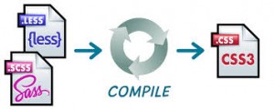
Sass is an extension of CSS3, adding nested rules, variables, mixins, selector inheritance, and more. It’s translated to well-formatted, standard CSS using the command line tool or a web-framework plugin. Sass has two syntaxes. The older syntax, called “the indented syntax” uses a syntax similar to Haml. It makes use of indentation to separate code blocks and newline characters to separate rules. The newer syntax, “SCSS” uses block formatting like that of CSS. It uses curly brackets to denote code blocks and semicolons to separate lines within a block. The indented syntax and SCSS files are generally given the extensions .sass and .scss respectively. Both these syntaxes are fully supported – there is no functional difference between them.

Features of Sass:

  • Fully CSS3-compatible
  • Language extensions such as variables, nesting, and mixins
  • Many useful functions for manipulating colors and other values
  • Advanced features like control directives for libraries
  • Well-formatted, customizable output
  • Firebug integration
  • Syntax

SASS is an excellent scripting language for web app development. But using it with frameworks makes web development even easier and enjoyable. One great thing about SASS is it has built in CSS color math. One can automatically change the color of the menu and the hover state manually. Another great way to use SASS is you can organize all of your CSS into a single file. It simply adds more power and better organizational tools, making it an easy choice as a go-to replacement.

LESS is a dynamic style sheet language that allows developers to reuse CSS elements and write LESS code with the same semantics. The LESS compiler is written in JavaScript, so you can just include it in your page along with your LESS stylesheet. It has everything that CSS is missing like Variables, Mixins, Nested rules, Operators and functions, Namespaces for grouping variables and mixins etc.

The similarity between these SCSS and LESS frameworks is its features and functions. But they slightly differ in syntax. They make web app development easier for the programmers and facilitate them to create intriguing web applications. SASS is only accessible to Ruby/Rails environments, while LessCSS can be used by anyone, with any languages, or just plain HTML website. For developers adopting these frameworks, it is essential to understand the paradigm shift these frameworks bring to client side application development.