Strict vs. quirks modes – How to trigger each and why this matters?
Quirks mode and strict mode are the two ’modes’ modern browsers can use to interpret your CSS.
Anything before the DOCTYPE, like a comment or an XML declaration will trigger quirks mode in Internet Explorer 9 and older versions.
In HTML5, the only purpose of the DOCTYPE is to activate full standards mode. Older versions of the HTML standard gave additional meaning to the DOCTYPE, but no browser has ever used the DOCTYPE for anything other than switching between quirks mode and standards mode.
Have you ever worked with retina graphics? If so, when and what techniques did you use?
On retina devices the websites are not broken. They just look vague and pixels start appearing as low resolution images. So the only way to correct is to resize the images by following one of the techniques below:
i) Using alternate high resolution pixels
Suppose we have an image of 200px by 400px (CSS pixels) and we want to display it properly in a retina display, we can upload an alternate image of size 400px by 800px in our server and render them whenever the webpage is opened in a retina device.
ii) Using @face-fonts instead of images icon
Image fonts will automatically resize themselves on the high resolution devices just like normal fonts do. Using @face-fonts is an alternate solution to Bitmap icons.
iii) Using SVG images instead of Bitmap images
Bitmap images are images that multiply their pixels in retina displays. But they come with a limitation of getting multiplied infinite number of times. This is where SVG images come into role. They also solve our problem of uploading alternate images of double resolution plus they solve the bandwidth problem too.
iv) Using JavaScript to replace all the images with double sized image
We can use JavaScript to replace all images in a webpage but it will be a difficult task replacing each one of them by writing individual code.
If you have 10 different stylesheets for a given design, how would you integrate them into the site?
Every CSS file we use on a website will add time to our page load speed. CSS will not care where it is at or how many files it is in. However in most cases we can have a combination of two or more CSS files together.Developers handle this situation in multiple ways. Few of them simple combine by copy pasting one from another.
The other possible way to combine CSS files using YUI Compresser, that combines CSS and minimizes code and is good for performance. Few handle this by using build tools like GRUNT.
One CSS file that contains all the styles of the separate CSS files combined will work just as well and improve the page speed. Putting all of the CSS into one file substantially reduces the amount of time it takes to load our web pages because we are reducing the amount.
What are downsides of a CSS “reset”? What should be used as a better alternative?
CSS Reset is file (with extension .css) which helps in reducing browser inconsistencies by creating common defaults styles for all browsers.
Downsides of “reset” file:
i) Creates new defaults that you may or may not want (unwanted code).
ii) Many a tiomes, developers end up re-writing the new defaults by styling many of them manually. Sometimes redundant code may creep in.
iii) It adds unnecessary load time.
iv) Developers own styles often gets overwritten,So a precautionary code has to be put in place (more code!)
A better alternative is to use Normalize.css
A Normalize CSS is acustom CSS file that will render all elements that comply with modern standards and are consistent. Other CSS files must not precede the normalize.css
The positive points:-
• Useful defaults are preserved.
• For a big range of elements, it normalizes the CSS
• It will fix bugs and common browser inconsistencies.
• Improves usability.
• Detailed comments explain what the code does.
What’s the difference between feature detection, feature inference, and using the UserAgentstring
Feature Detection is to verify if a feature works in a particular browser or not. The feature can be either a CSS property or a Java Script Method.
Feature Inference is to assume that a CSS property/ JS method is available in all the browsers, by verifying it in a single browser. The fact is it can or it cannot be available. For ex. the text( ) function is implemented in Chrome , but it is not implemented in Firefox which will give out an error eventually when used. So we have to be careful.
The User Agent is a software which identifies your operating system, browser and its version. When you a visit a particular webpage, the browser sends a user-agent string to the host, implying that only the content/data related to that particular browser should be displayed.
But among all the three techniques, feature detection is considered a good practice.
Describe what a “reset” CSS file does and how it’s useful?
A set of CSS rules that will reset the styling of all HTML elements, is described as a “reset CSS”file.
In order to have pages with no styles appear more proper, all browsers havetheir own default stylesheet. Most of the browsers by default have links as blue and visited links as purple, they also give tables certain amount of border, also they apply variable font-sizes to h1, h2, h3, h4, h5, h6. and also certain amount of padding to almost all the elements in the page.
The aim of this reset file is ultimately to reduce the browser inconsistencies like default line heights, borders, color,font sizes of headings, paddings and margins.
The trend of accessing content on tablets and Smartphones has revolutionized many users to shift from desktop to mobile devices. Their digital way of accessing services and products has become inevitable. This has led developers to develop two approaches to mobile-ready web design: Responsive websites and Mobile websites.
A responsive website is a website that can adapt itself on various screens-sizes regardless of the devices that you use it. Responsive websites are usually optimized for viewing on mobile phones, tablets and desktops. Hence, the Responsive Web Design approach eliminates the need for developing a separate website for every mobile device platform. This method of designing is now preferred by web designers and developers as it covers a large number of users’ devices.
Mobile website is a website created significantly for small-screen devices. Similar to a regular website, mobile websites can also be accessed through various browsers. A mobile website generally consists of limited content and hence it is light-weighted and faster when compared to regular websites. If a browser is using a mobile phone to view a website, then the website automatically detects that the website has accessed on a mobile phone and then it redirects the browser to a separate URL to view the mobile specific website.
Mobile applications are the applications developed mainly for mobile device platforms such as iPhone, Android, Google, etc. Usually, mobile applications have been downloaded from app stores. There are a large number of mobile applications available for various platforms. As there are many mobile phones available with various operating systems, mobile applications are incredibly expensive to develop and maintain. If you want to provide users a mobile experience that engrosses speedy decisions and also selling and buying, then you need to have a separate mobile website.
If you want to constantly add something or update your website based on new trends, then having a single responsive web design is the best option. When thinking about the advantages of using responsive websites, first thing that comes to our mind is the download activities that are not required for responsive websites whereas the mobile applications require you to download them from app stores. Also, a responsive website doesn’t require you to update any information again and again. You just need to update the information on your main website that makes your work done.
Responsive websites provides you the compatibility across various platforms. It enables the content updates in the websites driven by Content Management Systems. The main disadvantage of using a responsive website is that the responsive website cannot be used without an internet connection while the mobile applications support this situation. Comparing the development cost, both responsive websites and mobile applications entail a strong budget. As a responsive website is entirely composed of complicated codes and technicalities, it requires a huge development cost. However, a mobile website requires a very low development charges. When considering the optimization process and SEO, responsive website takes up the priority than the mobile websites.
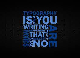
Technology advancements has popularized a typography style in websites. The ability of selecting the appropriate font has broaden to the extreme to make websites attractive. Mix and Match typography has become the necessary features of web design for creating the best user experience. To improve the website look and feel in long run, selecting the right typographic plays the key role to leave viewers attractive. After years of working, many customers are focusing and pushing designers to go with mix and match typography style of usage in their websites.
With emergence of new trends popping up for better readability, there is raise in usage of usage of typography in web design. Most notably, retro typography on vintage style websites is quiet powerful across the web. This trend has been around for a while but now we are seeing this in full force for websites who want to set up their brand in bold and visually interesting ways. This Mix and Match typography relies on the designer’s ability to choose the right fonts to match not just the message, but the other typographic styles in use.
Some designers usually stick to one font to what they like, but it is good to mix and match fonts with the flow of website without effecting the overall look. Think of not to use too-small or too loopy fonts that are hard to read and look for long periods of time. Though there are several kinds of fonts available, look for the right mix and match typography that fits the mood and aesthetic of your design. Try out new things to achieve a desired effect for your website allowing viewers with maximum readability.
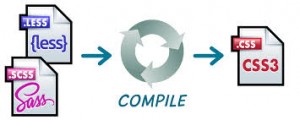
There are numerous CSS frameworks that are used to develop web applications such as Sass and LESS. They are both CSS based frameworks but the complexity of app handled by these frameworks are different. Each of these frameworks is suited for different web app development. Here I have provided a brief introduction between these frameworks and its features.
Sass is an extension of CSS3, adding nested rules, variables, mixins, selector inheritance, and more. It’s translated to well-formatted, standard CSS using the command line tool or a web-framework plugin. Sass has two syntaxes. The older syntax, called “the indented syntax” uses a syntax similar to Haml. It makes use of indentation to separate code blocks and newline characters to separate rules. The newer syntax, “SCSS” uses block formatting like that of CSS. It uses curly brackets to denote code blocks and semicolons to separate lines within a block. The indented syntax and SCSS files are generally given the extensions .sass and .scss respectively. Both these syntaxes are fully supported – there is no functional difference between them.
Features of Sass:
Fully CSS3-compatible
Language extensions such as variables, nesting, and mixins
Many useful functions for manipulating colors and other values
Advanced features like control directives for libraries
Well-formatted, customizable output
Firebug integration
Syntax
SASS is an excellent scripting language for web app development. But using it with frameworks makes web development even easier and enjoyable. One great thing about SASS is it has built in CSS color math. One can automatically change the color of the menu and the hover state manually. Another great way to use SASS is you can organize all of your CSS into a single file. It simply adds more power and better organizational tools, making it an easy choice as a go-to replacement.
LESS is a dynamic style sheet language that allows developers to reuse CSS elements and write LESS code with the same semantics. The LESS compiler is written in JavaScript, so you can just include it in your page along with your LESS stylesheet. It has everything that CSS is missing like Variables,Mixins,Nested rules,Operators and functions,Namespaces for grouping variables and mixins etc.
The similarity between these SCSS and LESS frameworks is its features and functions. But they slightly differ in syntax. They make web app development easier for the programmers and facilitate them to create intriguing web applications. SASS is only accessible to Ruby/Rails environments, while LessCSS can be used by anyone, with any languages, or just plain HTML website. For developers adopting these frameworks, it is essential to understand the paradigm shift these frameworks bring to client side application development.

 The trend of accessing content on tablets and Smartphones has revolutionized many users to shift from desktop to mobile devices. Their digital way of accessing services and products has become inevitable. This has led developers to develop two approaches to mobile-ready web design: Responsive websites and Mobile websites.