Page speed refers to how fast your site loads for a user, something Google takes into account while ranking websites since a faster loading page directly translate to better user experience. If the interviewer asks what you would do to increase page speed, describe how you’ve achieved this in the past with examples such as reducing image sizes, enabling compression, reducing redirects, removing render-blocking JavaScript, leveraging browser caching, improve server response time, using a content distribution network to compress files, optimizing the code etc.
Why do we need a DOM? Why can’t we just manipulate the HTML? I would like to know the reasoning behind it, and why the concept of a DOM was born.
The purpose of the document object model is to manipulate a document with javascript. Without that, no front end scripting involving the document is possible. (Note that you can alter HTML elements in real time with CSS as well, but you’re limited to CSS properties indeed).
As for HTML, it’s a markup language, not meant for scripting. Just as styling is delegated to CSS, front end scripting is delegated to JS.
The use of HTML/CSS and JS is consensual because all major browsers implement them, following specifications (W3C specifications for HTML/CSS and ECMAScript specification for JS). (Note that while there are official sources to tell how they must behave, there are minor implementation differences for all three between browsers).
Simply put, HTML is to describe what is in a document, CSS is to describe how is what HTML describes, JS is to script anything with all that, based on an event driven fashion.
A recipe is a collection of resources, and typically configures a software package or some piece of infrastructure. A cookbook groups together recipes and other information in a way that is more manageable than having just recipes alone.
For example, use a template resource to manage your HTML home page from an external file. The recipe states the configuration policy for your web site, and the template file contains the data. You use a cookbook to package both parts up into a single unit that you can later deploy.
How to center absolute element in div i.e I need to place a div (with position:absolute;) element in the center of my window.?
Create the any class mentioned as below and assign it to your div..inner {
position: absolute;
left: 50%;
top: 50%;
transform: translate(-50%, -50%);
}
Here the clue is, that left:50% is relative to the parent while the translate in transform is relative to the elements width/height.
This way you have a perfectly centered element, with a flexible width on both child and parent.This works even if the child is bigger than the parent.
You can also center it vertically with this (Note : width and height of parent and child can be totally flexible(i.e. Unknown)). cheap hotels
Floating elements – how to use them, troubles with them, and how to work around the troubles?
Float property is used for wrapping text around images, Floats can be used to create entire web layouts and are also helpful for layout in smaller instances.
The CSS float property allows a developer to incorporate table-like columns in an HTML layout without the use of tables
One of the most common symptoms of float-heavy layouts is the “collapsing parent”. One of the most common ways to fix a collapsed parent element is to place an element with the clear property after our floated element. This will cause the parent to begin reflowing after the floated element. In IE 7, the Bottom Margin Bug is shown when a floated parent has floated children inside it, bottom margin on those children is ignored by the parent.
Quick fix:using bottom padding on the parent instead.
Top 3 Responsive Design Testing Tools You Should Know
Based on the concept of responsive architectural design, the ground breaking approach of Responsive Web Design was created. With the perpetually evolving nature of technology and the copious releases of newer and better devices, it was necessary that this approach be formulated.
Having appreciated the efforts of the pioneers behind the RWD approach and the technology itself, let us now shift our attention to the requirements of the contemporary market. The cut-throat competition, the increasingly prevalent emergence of complete web based businesses and the abundant availability of smartphones has increased the importance of RWD for clients.There are many testing tools in the market that check the transitions and assess compatibility but out of the plethora of options available, three stand out.
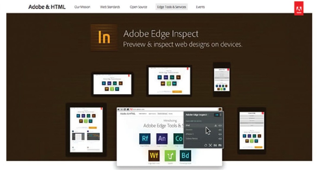
Adobe Edge Inspect CC
Top of the list is Adobe Edge Inspect, the erstwhile “Adobe Shadow” which is one of the many tools released under the ambit of Adobe Edge, the suite. This tool was developed to preview web designs on popular mobile formats. The primary aim however, was to prevent the design’s associated files from being published onto a server. This tool enables each mobile device paired with the computer to display the same site in its own specific render and mode of presentation be it either IOS or Android. Instead of the routine and standard practise of previewing a site that has been optimized for mobile viewing on a desktop system, the file is sent to the paired devices using this tool where the transition happens and the transformed view is displayed.
This tool also enables live editing of code with the changes being displayed on the paired devices as they are made. The connection host computer can also remotely collect all screenshots from the paired devices using this tool. Wireless pairing of multiple android & IOS devices is possible with this tool. In addition to the above, Adobe Edge Inspect also allows; changes to be made to HTML mark ups, tweaks in CSS rules, JS bin integration, clear caches in devices and refresh pages. It also supports HTTP & SSL/HTTPS authentication support.
Pros:
Fast, (mostly) accurate rendering across devices.
You can take screenshots on each device.
While the app is running on a device, the screen does not go to sleep. This is a nice feature, as you’re not constantly clicking and sliding on devices to wake them up.
Cons:
Requires installing and running a standalone app to do any testing.
Requires Edge Inspect app to be installed on every device.
Requires installation of Chrome plugin for managing devices, debugging, manual reloads, etc.
Currently can only be run on Android and iOS devices. Meaning, no testing on other browsers, platforms, Microsoft Surface, etc.
Often has a real problem loading external Typekit fonts.
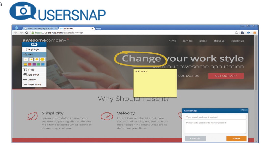
Visual feedback + bug reporting on responsive web sites
Next comes the bug tracker tool Usersnap. This tool can be added as a widget to any web browser and used as a bug tracking system thereby enabling developers to improve Q&A process for projects. The tool’s “Feedback Widget” provides a unique method of reporting where the bug information is displayed on the page itself. It also allows developers and designers to seek clarification through feedback forms if required. These forms, that come in a number of attractive themes, only ask for comments, that’s all, no exhaustive information sought, no hassles for the users.
It enables sending of bug reports as screenshots without the aid of any plug in. Numerous options of demarcating the bugs such as, highlighting, using a pen, adding a note, blacking out the area, using arrows, pixel rulers and adding comments have been incorporated simplifying the entire process. The website loading time and performance remains unaffected as the tool is loaded asynchronously and delivered through a strong CDN. Also, Browser specific issues can be viewed immediately as a view of the user’s browser is sent as a screenshot.
Pros:
Saves testing time by providing clear bug reports.
Screenshots with comments from the users and testers are sent via feedback button to fix problems faster.
Helps in improving the loading time and performance.
Reduces communication overhead significantly.
In-Browser Screenshot-Sees browser specific issues immediately.
Supports Single Page Applications.
Cons:
Upgrades are pro-rated to make use of all features.
To work in local development environments, we require service like PageKite.
Need to check browser extensions to work in a local environment.
Not possible to capture the state of flash objects(video position).
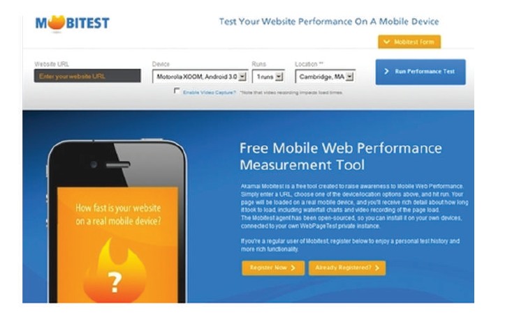
The third on the list is Mobitest, a free tool that enables testers to enter a URL, choose the device they want to run the test for, select the number of tests that are to be run and hit enter. As simple as that. The page is then loaded on a mobile device and detailed information such as the time taken for loading, waterfall charts and the page load video recording are provided. The advantage offered by Mobitest is that tests need only be specified once. Test suites for each platform will be generated automatically. The tool allows developers to specify a single set of tests for applications. These tests can then be used with each platform upon which the application is being developed.
Pros:
Measures page load times on real mobile devices.
Captures screenshots during page load, and shows a video visualizing the page load.
Runs on iOS, Android and Blackberry, regardless of the hardware – smartphone, tablet or simulator.
Once installed, they run in an infinite loop on the device, turning it into a (very) small server.
Gives lots of performance statistics such as page load times and average page size along with other statistics.
Cons:
It doesn’t support scripted tests like the desktop agents.
Devices test are limited to a few selected Android and iOS models.
Network connection can’t be modified, so testing latency is out of question.
Can test only public URLs (so anything in stealth mode or behind a firewall doesn’t work).
Apart from these tools, there is another tool we thought of sharing with you as a bonus is Google DevTools, which is a very powerful tool and the device mode makes it an even more indispensable part of the modern web designer’s toolkit. Developers can take advantage of Chrome’s new “Screencast” technology by simply connecting their mobile device via USB and enable “USB Debugging” within the device settings. Google Chrome will take care of the rest by auto discovering your handset and integrating it within the developer tools options. With this, one can connect debug the webpage opened on mobile browsers. This helps developers in rectifying the issues like rendering, debugging remotely and more using desktop browser devtools.