Category Archives: mobile web testing tools

TOP FIVE SUGGESTIONS FOR MOBILE FRIENDLY WEBSITE

Top five suggestions for mobile friendly website

In the past few years’ mobile design has been detonated, but knowing what to do and where to start can be a big task. Mobile website design is not just about choosing between a mobile website or an application but, there is a range of options in between and aspects to take into account, including responsive web design, mobile-friendly web fonts, and much more.

To help you out, we have segregated together top tips on what to be considered while defining your mobile strategy and designing for mobile. So let’s dive deep-in and see the top suggestions for the mobile friendly website.

Mobile_Friendly_Website

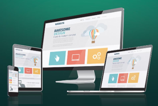
USE A RESPONSIVE DESIGN

Responsive design allows the website developers to create a website which is effortlessly viewable on different size devices. This reduces the amount of work the website developers have to do when it comes to creating a website.

The responsive design approach makes use of flexible layouts, flexible images, and cascading stylesheet media queries. When responsive design is used on a website, the web page will be able to detect the user’s screen size and orientation and can change the layout accordingly.

ALWAYS INCLUDE A VIEWPORT META TAG

The viewport is a virtual area used by the browser rendering engine to determine how the content is scaled and sized. Without this viewport, your website will not work perfectly on a mobile device. What the viewport meta tag tells your browser is that the page needs to get fitted into the screen. There are many different configurations that you can specify your viewport to control. Here’s what we recommend in using at the head of the document.

Note: This only needs to be declared once.

FONT SIZES AND BUTTON SIZES ARE ALWAYS MATTERS

Your font size and button sizes always matter a lot for mobile devices. For font size, it should be at least 14px. This may seem big, but instead of users to zoom-in to read the web content, make it easier for them by adjusting the font size for maximum readability. The only time the user should be choosing a smaller to a minimum of 12px, is on labels or forms.

As for buttons, the bigger the button, the better—it reduces the chances that the user will miss or hit the wrong button by mistake. For instance, Apple’s design guidelines recommend button sizes to be at least 44px by 44px. Following these guidelines will help to maximize the user’s experience on their mobile device and increase conversions for e-commerce sites.

USE HIGH-RESOLUTION IMAGES

High-resolution images are very important in responsive websites to ensure the user’s experience in a high standard. The latest models of iOS devices have high-definition screens which requires an image double the resolution of a desktop. Having extremely high-resolution images will help the developers to avoid in having pixelated or even blurry images when viewed on a retina-quality screen.

NEVER STOP TESTING

Once you’ve created your responsive website, test it for a multiple number of times. We don’t just mean “try it on one of your mobile devices multiple times;” test it on an iPhone, an Android, a Windows phone, and on different tablets. Test every page, user action, buttons; and while you’re testing, it’s always important to put yourself in the position of the user, or ask someone who didn’t design it to test it for you.

We hope these tips has provided you the guidance in knowing how to make your website mobile-friendly.

suggestions_for_mobile_friendly_website

TOP 3 MOBILE WEB TESTING TOOLS

Top 3 mobile web testing tools

Mobile applications are becoming more and more important for businesses and consumers who are expecting higher quality applications for mobile devices. You have many tools to create your website as you visualize it, it also became essential that you first test your website thoroughly before sending it live on mobile. The major problem here is that you are dealing with far too many mobile devices and mobile OS and hence, testing your website on each of these devices would turn out to be very onerous and expensive. In order to make your task simpler, there are some useful tools available to help you and ensure that your mobile is absolutely mobile-friendly.
top_3_mobile_web_testing_tools

Here we bring you a list of top 3 tools for testing your website intended to go live on mobile devices:

Google Mobilizer

The constant presence of the mobile phone puts a greater demand on mobile site’s availability and performance. But, as the adoption of the mobile web increases, device propagation, conflicting standards, and limited tools make developing and delivering quality mobile experiences, a challenge for many organizations.

The “Gomez mobile readiness test” is designed to help the organizations to quickly assess their site’s mobile readiness so that they can troubleshoot and improve it.

Just by entering the URL, the Gomez mobile readiness test returns a score between one to five which indicates how well the site complies with mobile web industry standards like W3C’s MobileOK checker. It also provides analysis of the website’s page weight and detailed test report from 30 proven mobile web practices. The Gomez platform identifies business impacting issues by testing and measuring Web applications from the “outside-in” across all users, browsers, devices, and geographies using a global network of over 10,000 locations.

Worldwide 2,500 customers ranging from small to large organizations are using Gomez to increase revenue, build brand loyalty, and decrease costs.

iPhoney

Are you looking for a way to see how your web creations look in iPhone? Then don’t look further, because iPoney gives you a pixel-accurate web browsing environment powered by Safari which you can use while developing web sites for iPhone. It is the perfect 320 by 480-pixel canvas for your iPhone development. Also, it is free of cost.

iPhoney is not an iPhone simulator, but it is designed for web developers who want to create 320 by 480-pixel websites for iPhone.

There are new added features to iphoney 1.2 and it is still open source. What so new in iphoney 1.2?

* View source to see the source code for the webpage you are viewing. It is great for checking iPhone targeted pages.

* Localized for Norwegian, French, and German users.

W3C MobileOK Checker

The World Wide Web Consortium announced the availability of W3C mobileOK checker. It is a free service that performs various tests on a web page to help the developer to determine its level of mobile-friendliness.

MobileOK checker builds on the suite of quality assurance tools already offered by W3C and “it does a nice job by helping the developers to improve their content one step at a time”.
To help and ensure the best user experience across a wide variety of mobile devices, the Mobile Web Best Practices Working Group defined a set of guidelines to follow while creating the web documents.
From there, the working group determined which tests could be automated while creating the mobileOK checker.

Some of the recommendations offered by mobileOK checker includes:

* XHTML Basic 1.1 for mark-up format.
* Images should be small and it should be in the form of GIF or JPEG.
* The whitespace and comments should be removed by adding the cleaning step in the publication process.
* The page size should be under 20KB and the mark-up should be under 10KB.
* If you are using scripts, ensure that scripting support is not required.
* Do not use frames, pop-up’s or applets.
The W3C mobileOK checker is definitely a good place to make your site more mobile friendly.