How to disable resizable property of text area?
Add CSS property resize as none for text area element in the following way
textarea{
resize: none;
}

Technology has gained fast pace with new advanced tools and languages enabling developers build rich internet-based applications. Wielding the true power of a CSS preprocessor is an adventure. There are endless languages, syntaxes, and features which are ready to use. Many get confused on which CSS preprocessor language to go with. In this article, we will be covering the various features and benefits of using different preprocessors – Sass and Less.
An Overview of Less
Less is a dynamic style sheet language that can be compiled into cascading style sheets (CSS) and run on the client or server-side. Less extends CSS with dynamic behavior such as variables, mixins, operations, and functions. It can be run on both client and server-side, with Node.js.
In simple terms, Less allows the user to write CSS in a smarter way by combining functions, mixins, operations, and many more. This means, the user can write more terse style information and can reuse things like colors and styles more easily. Less is open source. The first version of Less was written in Ruby; however, in the later version, use of Ruby has been depreciated and replaced by Javascript.
An overview of Sass
SASS is a scripting language that is interpreted into cascading style sheets (CSS). Sass is a pre-processing language and has two syntaxes, one is “indented syntax” and the other one is “SCSS”. The indented syntax uses the syntax similar to Haml. It uses indentation to separate the code blocks and newline characters to separate rules. Whereas, SCSS syntax uses block formatting same as CSS. cloud hosting info . It uses braces to denote code blocks and semicolons to separate rules. Both the syntaxes are traditionally given the extensions .sass and .scss.
Which one is better Sass or Less?
Installation
Installing Sass: Sass needs ruby installed to work. This comes pre-installed in MAC but, in windows, you need to install before you start playing with Sass.
To install Sass on the command line, run:
$ gem install sass
or with npm:
$ npm install sass
Installing Less: Less is inbuilt on Javascript. So the installation is as easy as linking Javascript library to your HTML document.
Alternatively, an easy way to install Less on the server is with npm;
$ npm install -g less
Features:
Here are the main features of Sass and Less.
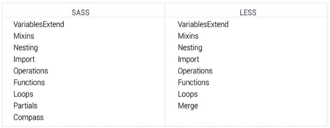
As we can see from features list above, the difference between Sass and Less is not huge. Both offer a good range of options to help you to write smart and efficient code.
The major differences between Less and Sass are variables, Inheritance, Looping logic, and compass.
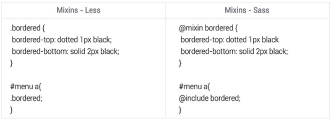
Mixins, Inheritance & Extend:
Mixins in Sass and Less are defined bit differently. In Sass, we use @mixin directive whereas in Less we define it as a class selector.
Mixins in Sass and Less are used to include properties from one ruleset to another. In Sass, this method is taken further with selector inheritance. The concept is identical, but instead of copying the whole property, Sass will extend or group selectors that have identical properties and values using the @extend directive.
Compass
Sass: has a compass on its side which contains the plethora of Mixins to write CSS3 syntax in less time. Compass extends way beyond just CSS3 Mixins. It also has added other features like Helpers, Layout, Typography, Reset, and Sprite images.
Less: Less also has several extensions, unlike Compass (which has everything in one place), they are separated. Each and every extension is built by a different group of developers. This will not cause problems for seasoned users, but it could be burdensome for those starting out.
These are the major differences between Sass and Less.
Final Thought:
These two libraries share a lot of basics. Both of tools are fantastic for the designers who code, and they can also help developers efficiently and quickly. Depending on the information and subtlety to your projects, choose the preprocessor that seems to be best for your project.
The best way is to apply a ternary operator to the view element.
For ex. ng:class=”( = = = ) ? : <else,apply false condition>”.
In the above syntax, we check for the condition if the current value id equal to the required value. If it is true, then the first assigned class is applied. If it is false, then the second assigned class is applied
Internet Explorer versions before IE9 do not support media queries. But we use IE’s conditional commenting to achieve this. Using this, you can specify an IE 8/7/6 specific style sheet which over writes the previous rules.
For example:
<link rel=”stylesheet” type=”text/css” media=”all” href=”style.css”/>
<!–[if lt IE 9]> <link rel=”stylesheet” type=”text/css” media=”all” href=”style-ie.css”/>
<![endif]–>
This won’t allow for a responsive design in IE8, but could be a simpler and more accessible solution than using a JS plugin.
Give opacity as 0.5 in your background color rgba like background-color:rgba(255,0,0,0.5); based on your color in your style property of the element tag.
Eg.
<p style=”background-color: rgba(255,0,0,0.5);”></p>
Float property is used for wrapping text around images, Floats can be used to create entire web layouts and are also helpful for layout in smaller instances.
The CSS float property allows a developer to incorporate table-like columns in an HTML layout without the use of tables
One of the most common symptoms of float-heavy layouts is the “collapsing parent”. One of the most common ways to fix a collapsed parent element is to place an element with the clear property after our floated element. This will cause the parent to begin reflowing after the floated element. In IE 7, the Bottom Margin Bug is shown when a floated parent has floated children inside it, bottom margin on those children is ignored by the parent.
Quick fix:using bottom padding on the parent instead.
Float property can be used to align an entire block element to the left or right such that other content flows around it.
For instance, Float is used for wrapping text around images or create table-like columns in an HTML layout without the use of tables.
The most common problems of float-heavy layouts are:
The “collapsing parent”.
(a) Fix 1: one of the most common ways to fix a collapsed parent element is to place an element with the clear property after the floated element. This will cause the parent to begin reflowing after the floated element.
(b) Fix 2: There is a method that allows a parent element to clear itself of any floated elements inside it. It uses a CSS property called overflow with a value of hidden. Note that the overflow property was not intended for this type of use, and could cause some issues such as hiding content or causing unwanted scrollbars to appear.
In IE 7, the Bottom Margin Bug is when if a floated parent has floated children inside it, bottom margin on those children is ignored by the parent. Quick fix:using bottom padding on the parent instead.
Yes, by using :before and :after, we can achieve this. However, for dynamic data, we may have to use JQUERY.
Only CSS (static text)
<h1></h1>
h1:before {
content: ‘Exam';
color: #0000ff;
font-size: 32px;
}
h1:after {
content: ‘ple';
color: #ff0000;
font-size: 32px;
}
Result: