AGILE METHODOLOGY-DRIVING FORCE BEHIND SOFTWARE DEVELOPMENT

Agile methodology is continuing to be a Driving Force behind Software Development

Agile methodology is a collection of software development strategies in which requirements are obtained through collaboration between self organizing teams. It is a term that was derived from the Agile manifesto, which was written in 2001 by a technical group that included developers of Scrum, Extreme Programming and Dynamic Systems Development Method. The Agile process promotes and requires that functionalities with higher business value are done first.

Agile methodology

Popularity of Agile methodology:

According to a study conducted by Version One, Technology Company known for development of Agile lifecycle management software, 94 percent of business organizations in the world are practicing Agile. It is quickly becoming the de facto standard of software development and Agile will become the best practice of software development in the next ten years. Acceleration of product delivery, accommodation of change and driving of productivity are the main reasons for the high popularity of Agile methodology. Connoisseurs of web development believe that Agile methodology is all about delivering value to the business on a repeatable, reliable and rapid fashion.

Transitioning from waterfall to Agile:

The advantages of Agile over Waterfall are conspicuous and businesses, whose very success depends on making the most advantageous decisions, are flocking to the Agile methodology. In a plethora of companies that have been baptized as Agile in recent times, Toyota is a brand that deserves a detailed mention.

The name Toyota has become synonymous with fast, efficient, luxurious and dependable automobiles. What most of us don’t know is that Toyota does not just make cars, it also develops its own software. The folks at Toyota understand the importance of automatic electronic control system which is why the Project General Manager from the Automotive Software Engineering Department, Mr. S. Ishii referring to the importance of developing software for their cars, said that “Toyota needs to become an IT company”. Mr. Ishii said that they would probably be shifting their approach from Waterfall to Agile.

He stressed on the importance of detecting bugs early in the development cycle to prevent expensive rectifications. A defect detected in the prototyping stage is 50 times less expensive than if it is discovered in the production phase. The defect will be dearer by 1000 to 10000 times if it is discovered after the production phase. The fact that Toyota is incurring a cost of 2 billion dollars due to recalls and lost sales that were the result of a software glitch in the braking system of their Prius model has made them think of how important prompt detection of issues is. This made them transform from waterfall to Agile.

How Agile & Scrum go mainstream?

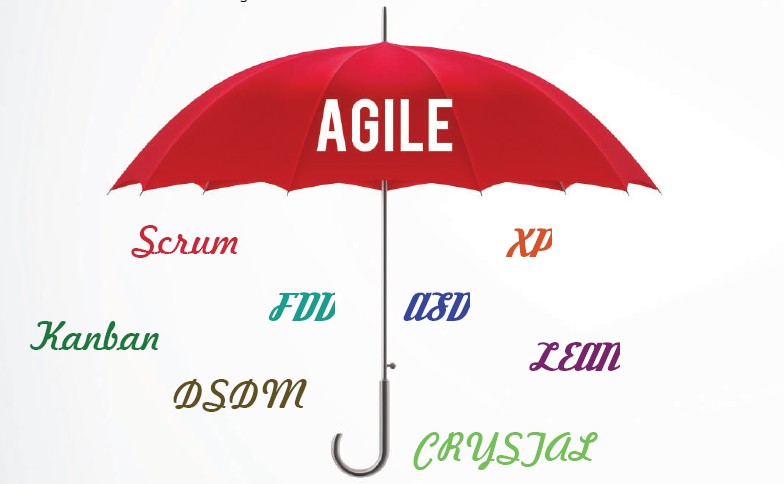
As Agile does not provide concrete steps, organizations seek more specific methods within the Agile environment including crystal clear, extreme programming, feature driven development, dynamic systems development method and Scrum. Scrum gives special importance to decision making from real time scenarios rather than speculation. It can be defined as a simple set of roles, responsibilities and meeting that never ever changes.

agile & scrum methodology

12 Principles of Agile Development Manifesto:

  • Customer satisfaction by rapid delivery of useful software
  • Welcome changing requirements, even late in development
  • Working software is delivered frequently
  • Working software is the principal measure of progress
  • Sustainable development, able to maintain a constant pace
  • Daily cooperation between business people and developers
  • Face to face is the best form of communication
  • Projects are built around motivated individuals who should be trusted
  • Continuous attention to technical excellence and good design
  • Simplicity is essential
  • Regular adaptation to changing circumstances

Scrum is an iterative development process and projects progress via a series of iterations called sprints. It does not include any traditional software engineering roles such as programmer, designer, tester and architect. The scrum team forms a common ownership of the work to be performed rather than just focusing on particular task.

While scrum is the most popular example that encapsulates agile philosophy, there are a number of Agile techniques available including pair programming, test driven development and continuous integration.

Overall, Agile manifesto deals with four core values of individuals and their interactions, delivering working software, customer collaboration and high performing teams which is the reason it’s continuing to be a Driving Force behind Software Development.

IS MOBILE FIRST STILL RELEVANT?

Is Mobile First Still Relevant?

Yes, the old debate of whether basing a customer’s online experience should be limited to a single device is still going on! The fact that a professional or business would want to over-simplify their website’s user-experience seems like the perfect recipe for failure.

Mobile First

Although a lot of web developers believe and advocate the use of responsive designs, there is almost unanimous agreement that having a responsive website doesn’t mean that you’re set for life. The fact that a website is responsive only means that it is viewable on a multitude of devices. It doesn’t necessarily guarantee that the user will have an enjoyable experience.

Now you might think that your customers might not expect much from your mobile website because they understand that you can only do so much with a limited screen size. The truth, however, is the exact opposite as the next-gen users want the best of everything, all the time! Whether they’re booking movie tickets on their desktops or buying a pair of shoes through their smartphones, people want to have a quick and seamless transaction.

Benefits of Mobile-first:

In Mobile First approach, the idea of designing the Smartphone experience comes first and then developing the design for tablets, desktops and possibly beyond. Considering a mobile website first enables developers to meet mobile users’ requirements on a very basic level. This is of course due to the major constraints of both performances as well as size of a mobile platform. Not only are mobile users confined to a device with a physically smaller screen, but they typically run on lower connection speeds, restrictive data plans or even no data plan at all! This forces developers to be more concise and focused on the kind of content that they wish to deliver to the client.

It makes them think twice before simply filling up their websites with unnecessary fluff. Here are the few advantages of mobile first:

  • Easier and quicker to manage one project and web site than multiple.
  • Reduces cost of development and maintenance by only maintaining one infrastructure and one team.
  • Typically will work automatically on new devices, e.g. tablet without customisation.
  • Simple technical solution to a common issue.
  • Could improve SEO as all traffic will be directed to one URL rather than multipe sites.
  • No need for device recognition

Marketing Statistics:

If you’re still not convinced that a mobile first approach would cause more harm than good for your website and your overall business, here are a few more pointers that should help you seal the deal:

  • There are over 1.5 billion mobile web users worldwide and counting.
  • In the U.S. alone, more than 25% of Web users are mobile-only, that means that they don’t like, don’t own or simply don’t want to use a desktop or laptop to access the internet.
  • Globally, users have downloaded mobile apps over 11 billion times.
  • The sale of mobile device globally is also increasingly on the rise, with no signs of slowing down. And according to statistics, over 90% of these mobile devices possess the ability to the mobile Web space.

mobile first approach
Problems with Mobile First:

Problems with Mobile First

The mobile first approach may not be the best choice if there is a limited budget or a pre-existing site design. Restructuring a website that is already designed and going back to the drawing board to begin with an entirely new process can be costly and it takes a long time. Here are the few drawbacks of mobile first:

  • Right from the outset, it hits with constraints like smaller screens, fewer resources and device limitations.
  • With a faulty design and less amazing features, losing customers could happen even before acquiring them, therefore constant work in improving the app is needed.
  • Rescaling for mobile devices typically generates very long pages requiring lots of scrolling which is a bad mobile user experience.
  • Requires the same amount of testing but needs to be done across a lot more devices even when you make an update.

However, these drawbacks should not be the primary focus. Rather, the different needs of the target audience and strategic goals of the website should be at the forefront of all considerations. In fact, web designers and developers alike have been oversimplifying the issue of mobile first since the early 2000s, which has led many to believe that responsive web design is the answer to all of their development woes. Also, it’s possible that the best practices of mobile design will subsume desktop design, bringing simpler and more efficient interfaces to users everywhere.

The Final Verdict:

The Final Verdict

Typically, a responsive design is structured around the concept of numerous media queries that target certain devices that have specific screen size restraints. And with this information in hand, you can easily create codes for your initial CSS design and then eventually use these media queries to draft additional size support.

And if you think that you can ignore all of this by either maintaining two separate websites, you are gravely mistaken. If you build a separate mobile website by totally avoiding the use of a responsive design, you will end up with two fully-functional websites. This subsequently gives you two entire codebases to design and maintain, doubling your work. Ultimately, it’s best to get over the platform-first approach and embrace the mobile first approach, for your own convenience and the convenience of all your users.

TOP 3 RESPONSIVE DESIGN TESTING TOOLS YOU SHOULD KNOW

Top 3 Responsive Design Testing Tools You Should Know

Based on the concept of responsive architectural design, the ground breaking approach of Responsive Web Design was created. With the perpetually evolving nature of technology and the copious releases of newer and better devices, it was necessary that this approach be formulated.

Having appreciated the efforts of the pioneers behind the RWD approach and the technology itself, let us now shift our attention to the requirements of the contemporary market. The cut-throat competition, the increasingly prevalent emergence of complete web based businesses and the abundant availability of smartphones has increased the importance of RWD for clients.There are many testing tools in the market that check the transitions and assess compatibility but out of the plethora of options available, three stand out.

Adobe Edge Inspect CC

Adobe Edge Inspect CC

Top of the list is Adobe Edge Inspect, the erstwhile “Adobe Shadow” which is one of the many tools released under the ambit of Adobe Edge, the suite. This tool was developed to preview web designs on popular mobile formats. The primary aim however, was to prevent the design’s associated files from being published onto a server. This tool enables each mobile device paired with the computer to display the same site in its own specific render and mode of presentation be it either IOS or Android. Instead of the routine and standard practise of previewing a site that has been optimized for mobile viewing on a desktop system, the file is sent to the paired devices using this tool where the transition happens and the transformed view is displayed.

This tool also enables live editing of code with the changes being displayed on the paired devices as they are made. The connection host computer can also remotely collect all screenshots from the paired devices using this tool. Wireless pairing of multiple android & IOS devices is possible with this tool. In addition to the above, Adobe Edge Inspect also allows; changes to be made to HTML mark ups, tweaks in CSS rules, JS bin integration, clear caches in devices and refresh pages. It also supports HTTP & SSL/HTTPS authentication support.

Pros:

  • Fast, (mostly) accurate rendering across devices.
  • You can take screenshots on each device.
  • While the app is running on a device, the screen does not go to sleep. This is a nice feature, as you’re not constantly clicking and sliding on devices to wake them up.

Cons:

  • Requires installing and running a standalone app to do any testing.
  • Requires Edge Inspect app to be installed on every device.
  • Requires installation of Chrome plugin for managing devices, debugging, manual reloads, etc.
  • Currently can only be run on Android and iOS devices. Meaning, no testing on other browsers, platforms, Microsoft Surface, etc.
  • Often has a real problem loading external Typekit fonts.

Responsive Design Testing Tools
Visual feedback + bug reporting on responsive web sites

Next comes the bug tracker tool Usersnap. This tool can be added as a widget to any web browser and used as a bug tracking system thereby enabling developers to improve Q&A process for projects. The tool’s “Feedback Widget” provides a unique method of reporting where the bug information is displayed on the page itself. It also allows developers and designers to seek clarification through feedback forms if required. These forms, that come in a number of attractive themes, only ask for comments, that’s all, no exhaustive information sought, no hassles for the users.

It enables sending of bug reports as screenshots without the aid of any plug in. Numerous options of demarcating the bugs such as, highlighting, using a pen, adding a note, blacking out the area, using arrows, pixel rulers and adding comments have been incorporated simplifying the entire process. The website loading time and performance remains unaffected as the tool is loaded asynchronously and delivered through a strong CDN. Also, Browser specific issues can be viewed immediately as a view of the user’s browser is sent as a screenshot.

Pros:

  • Saves testing time by providing clear bug reports.
  • Screenshots with comments from the users and testers are sent via feedback button to fix problems faster.
  • Helps in improving the loading time and performance.
  • Reduces communication overhead significantly.
  • In-Browser Screenshot-Sees browser specific issues immediately.
  • Supports Single Page Applications.

Cons:

  • Upgrades are pro-rated to make use of all features.
  • To work in local development environments, we require service like PageKite.
  • Need to check browser extensions to work in a local environment.
  • Not possible to capture the state of flash objects(video position).

Mobitest

The third on the list is Mobitest, a free tool that enables testers to enter a URL, choose the device they want to run the test for, select the number of tests that are to be run and hit enter. As simple as that. The page is then loaded on a mobile device and detailed information such as the time taken for loading, waterfall charts and the page load video recording are provided. The advantage offered by Mobitest is that tests need only be specified once. Test suites for each platform will be generated automatically. The tool allows developers to specify a single set of tests for applications. These tests can then be used with each platform upon which the application is being developed.

Mobitest Performance Testing Tool

Pros:

  • Measures page load times on real mobile devices.
  • Captures screenshots during page load, and shows a video visualizing the page load.
  • Runs on iOS, Android and Blackberry, regardless of the hardware – smartphone, tablet or simulator.
  • Once installed, they run in an infinite loop on the device, turning it into a (very) small server.
  • Gives lots of performance statistics such as page load times and average page size along with other statistics.

Cons:

  • It doesn’t support scripted tests like the desktop agents.
  • Devices test are limited to a few selected Android and iOS models.
  • Network connection can’t be modified, so testing latency is out of question.
  • Can test only public URLs (so anything in stealth mode or behind a firewall doesn’t work).

Apart from these tools, there is another tool we thought of sharing with you as a bonus is Google DevTools, which is a very powerful tool and the device mode makes it an even more indispensable part of the modern web designer’s toolkit. Developers can take advantage of Chrome’s new “Screencast” technology by simply connecting their mobile device via USB and enable “USB Debugging” within the device settings. Google Chrome will take care of the rest by auto discovering your handset and integrating it within the developer tools options. With this, one can connect debug the webpage opened on mobile browsers. This helps developers in rectifying the issues like rendering, debugging remotely and more using desktop browser devtools.

COMMON MISTAKES ANGULAR JS DEVELOPERS MAKE

Common Mistakes Angular JS Developers make

Angular JS is a Javascript structural framework for dynamic web pages that enables usage of HTML as a template language and allows the extension of HTML’s syntax in order to achieve the lucid and concise expression of an application’s components. It is one of the most widely used Javascript frameworks in existence today. The USP of Angular JS could perhaps be its unique ability to simplify the development process which is awesome as far as protoyping small apps is concerned. However, the sheer power of the framework enables scaling to full featured client side applications. Despite the developer-enticing advantages such as; Removal of registering callbacks, Non requirement of programmatic manipulation of HTML & DOM, Elimination of boilerplate code etc. a lot of drawbacks in terms of Angular JS usage haunt developers. Let us delve deeper into those so that we know what not to do and why.

Accessing the Scope through DOM

Few optimization tweaks are recommended for production and one of them is disabling debug information. DebugInfoEnabled is a setting which defaults to true and it allows for scope access through DOM nodes. If web developers want to try this, they should select a DOM element and access its scope with: Angular. Element (document.body).scope ( )

Not Using Named Views with UI Router

De-facto routing solution for AngularJS has been the UI-Router and ngRoute is basic for more sophisticated routing. There is a new NgRouter on its way and web development experts term it as basic for more sophisticated routing. UI-Router is prominent because it has awesome basic nesting, route abstraction and optional parameters. Solution to this mistake can be obtained from HTML code and it is necessary to separate them into files and states

Declaring Everything in the Angular World Using Anonymous Functions

This mistake is of very light importance and it is a question of style than avoiding Angular JS error message. If functions are assigned to a variable, web developers can manipulate and mutate functions. The code will be cleaner and it can be very easily split into files. By avoiding this mistake, web development experts get more expressive power through reusable code and splitting all code in self contained blocks is just bette.

JQuerying It-Detached DOM Tree

It is not recommended to use JQuery with Angular JS and it should be avoided at all costs.

Overusing Isolated Scope

There are two reasons for this issue and the first one is that we can’t apply two isolated scope directives to an element and we will have to encounter issues with nesting/inheritance/event processing.

Not Cleaning up Watchers, Intervals, Timeouts and Variables

Not cleaning up any watchers that are not bound to the current scope, intervals, timeouts, variables referencing DOM and JQuery plug-in is a mistake made by even experienced JS Developers. If the above mentioned tasks are not completed manually, we will have to encounter unexpected behavior and memory leaks.

Misunderstanding the Digest

Angular JS updates DOM as a result of callback functions to watchers and watchers are set for many other directives such as ng-if and ng-repeat.

Managing Numerous Watchers

The cycle can cause several performance problems if the number of watchers exceeds about 2000. This is due to the dirty checking that is carried out in a digest cycle.

Common Mistakes Angular JS Developers make

The aforementioned Immediately Invoked Function Expression (IIFE) prints the number of watchers presently on the page. To view the total number of current watchers on a page, just paste the IIFE in the console.

By employing this technique, ascertaining of the existence of duplication or whether unchanging data has a watch is made possible. Use Bindonce to template unchanged data using Angular. Bindonce is a simple directive that allows usage of templates within Angular. However, this does not prevent the count from increasing.

Leaving Batarang On The Shelf

A Google Chrome extension for debugging and developing AngularJS apps, Batarang is a great tool for developers. Batarang enables model browsing to learn the models that are bound to scopes as determined by Angular. This can be useful in isolation of scopes in order to be able to see where the locations are bound. It can also be helpful during working with directives. Whilst entering an untested codebase, Batarang helps determine which services should get the most attention. It also offers a dependency graph.

Offering performance analysis, Batarang enables detection of functions that take the most time in the digest cycle. In addition to the aforementioned benefits, non-utilization of Batarang also prevents developers from viewing the full watch tree, which can come in very handy when dealing with numerous watchers.

Utilization of jQuery

It’s standardized cross platform development and becoming almost a necessity in contemporary web development makes jQuery an amazing library. Albeit despite its appealing and attractive features, the philosophy of jQuery is not compatible with AngularJS. The fundamental difference between the two is that AngularJS is about architecture of applications whereas jQuery is a library for simplifying “HTML document traversal and manipulation, event handling, animation and Ajax.”

AngularJS allows for the extension of one’s HTML vocabulary for the application whereas jQuery compels the developer to think of existing HTML standards. Therefore, in order to truly comprehend the building of an application using AngularJS, the usage of jQuery must be stopped.

AngularJS is a framework that evolves with the community. By refraining from the conventions described above and understanding the reason why, it is hoped that the mistakes made in the usage of AngularJS are not repeated.

HOW TO PASS COMMAND LINE ARGUMENTS TO NODE.JS?

How to pass command line arguments to Node.js?

Three ways to pass the command line arguments to node.js

  • Using process.argv – process.argv is an array containing the command line arguments. The first element will be ‘node’, the second element will be the name of the JavaScript file. The next elements will be any additional command line arguments.

// print process.argv
process.argv.forEach(function (val, index,
array) {
console.log(index + ‘: ‘ + val);
});
This will Genearate,
$ node process-2.js one two=three four
0: node
1: /Users/mjr/work/node/process-2.js
2: one
3: two=three
4: four

  • Using yargs module – It is a light-weight option parsing with an argv hash.
  • Using minimist module – It is a module which parse argument options.

IS IT POSSIBLE TO APPLY CSS TO HALF OF A CHARACTER/WORD?

Is it possible to apply CSS to half of a character/word?

Yes, by using :before and :after, we can achieve this. However, for dynamic data, we may have to use JQUERY.

Only CSS (static text)

<h1></h1>
h1:before {
content: ‘Exam';
color: #0000ff;
font-size: 32px;
}
h1:after {
content: ‘ple';
color: #ff0000;
font-size: 32px;
}

Result:
CSS to half of a character

HOW TO HANDLE INITIALIZING AND RENDERING SUBVIEWS IN BACKBONE.JS?

How to handle initializing and rendering subviews in Backbone.js?

  • The view’s container element (affectionately known as its el) swaps out all of its html for new html, probably fetched from a template. The problem is in the child view.

There are several ways to handle this situation

1. Don’t Re-Render the Parent View

The simplest is to design a parent view that doesn’t require re-rendering. It has static content and serves as a container of child views. The child view container elements are never re-rendered, so they never go stale.

2. Reassign the Child View’s Element

Another more practical approach is to reassign the child view’s container once the parent view renders. Your view can now re-render appropriately, but its events will still be broken, as they are still stale. This second piece can be fixed with a call to delegate Events.

Example
Example.ParentView= Backbone.View.extend({
childView:new Example.ChildView(),
render:function(){
this.$el.html(this.template(this.model.
toJSON()));
this.childView.$el
=this.$(‘#child-view-container’);
this.childView.render();
this.childView.delegateEvents();
}
});

EXPLAIN “DEFERREDS”?

Explain “Deferreds”?

Deferreds

  • In their simplest form, deferreds allow you to specify what will occur when a computation/task completes or fails. jQuery’s specific implementation allows you to register callback functions that will run if a deferred resolves successfully, if it is rejected with errors, or if it is notified of some “progress” towards a resolved state (more on that later).
  • The “Deferred” pattern describes an object which acts as a proxy for some unit of computation that may or may not have completed.
  • The pattern can apply to any asynchronous process: AJAX requests, animations or web workers to name a few.

Important to understand:

  • Deferreds can be passed around indefinitely, and callbacks can continue to be added during the entire lifetime of the deferred object.
  • The key to this behavior is callbacks registered with the deferred will run immediately if the deferred is already resolved.
  • You don’t need to worry if the asynchronous unit of computation (e.g. an AJAX request) is finished or not.

EVENT DELEGATION SIMPLIFIED?

Event delegation simplified?

  • First let’s understand few terms in Event model in JS. When an event is trigged on an element (say a click on a button), then such event goes UP to all it’s ancestors elements and triggers “click” on all of button’s parents.

<body onclick=”alert(“I am the body”)>
<section onclick=”alert(“I am a section”)>
<div>
<button onclick=”alert(“I am a button”)>-
Click Me</button>
</div>
</section>
</body>

Clicking on the button will show up 3 alert boxes in the following order:

I am a button
I am a Section
I am the body

Whether an onclick is attached on each of it’s ancestors elements or not, the “click” event is fired on each of them. This is event bubbling. The “clicked” element (in this case button) is stored in ‘target’ property of the event object.

Now the event delegation:

  • Let’s say that we wanted to have a click event to each list item <li> element below. Instead of adding an event to each <li> element, we add the event at the parent level (ul in this case). The reason is that whenever a list item is clicked, the event bubbles up to top of DOM tree. When this happens, we can capture the event at UL (event bubbling) and easily determine from which element the event originated and perform the functionality to that element.

<ul id=”parent-list”>
<li id=”post-1″>Item 1</li>
<li id=”post-2″>Item 2</li>
<li id=”post-3″>Item 3</li>
<li id=”post-4″>Item 4</li>
<li id=”post-5″>Item 5</li>
<li id=”post-6″>Item 6</li>
</ul>

  • When the event bubbles up to the UL element, you check the event object’s target property to gain a reference to the actual clicked node.
  • JS Example

// Get the element, add a click listener…
document.getElementById(“parent-list”).addEventListener(”
click”,function(e){
// e.target is the clicked element!
// If it was a list item
if(e.target && e.target.nodeName ==”LI”){
// List item found! Output the ID!
console.log(“List item “, e.target.id.replace(”
post-“),” was clicked!”);
}
});