
Is Mobile First Still Relevant?
Yes, the old debate of whether basing a customer’s online experience should be limited to a single device is still going on! The fact that a professional or business would want to over-simplify their website’s user-experience seems like the perfect recipe for failure.

Although a lot of web developers believe and advocate the use of responsive designs, there is almost unanimous agreement that having a responsive website doesn’t mean that you’re set for life. The fact that a website is responsive only means that it is viewable on a multitude of devices. It doesn’t necessarily guarantee that the user will have an enjoyable experience.
Now you might think that your customers might not expect much from your mobile website because they understand that you can only do so much with a limited screen size. The truth, however, is the exact opposite as the next-gen users want the best of everything, all the time! Whether they’re booking movie tickets on their desktops or buying a pair of shoes through their smartphones, people want to have a quick and seamless transaction.
Benefits of Mobile-first:
In Mobile First approach, the idea of designing the Smartphone experience comes first and then developing the design for tablets, desktops and possibly beyond. Considering a mobile website first enables developers to meet mobile users’ requirements on a very basic level. This is of course due to the major constraints of both performances as well as size of a mobile platform. Not only are mobile users confined to a device with a physically smaller screen, but they typically run on lower connection speeds, restrictive data plans or even no data plan at all! This forces developers to be more concise and focused on the kind of content that they wish to deliver to the client.
It makes them think twice before simply filling up their websites with unnecessary fluff. Here are the few advantages of mobile first:
- Easier and quicker to manage one project and web site than multiple.
- Reduces cost of development and maintenance by only maintaining one infrastructure and one team.
- Typically will work automatically on new devices, e.g. tablet without customisation.
- Simple technical solution to a common issue.
- Could improve SEO as all traffic will be directed to one URL rather than multipe sites.
- No need for device recognition
Marketing Statistics:
If you’re still not convinced that a mobile first approach would cause more harm than good for your website and your overall business, here are a few more pointers that should help you seal the deal:
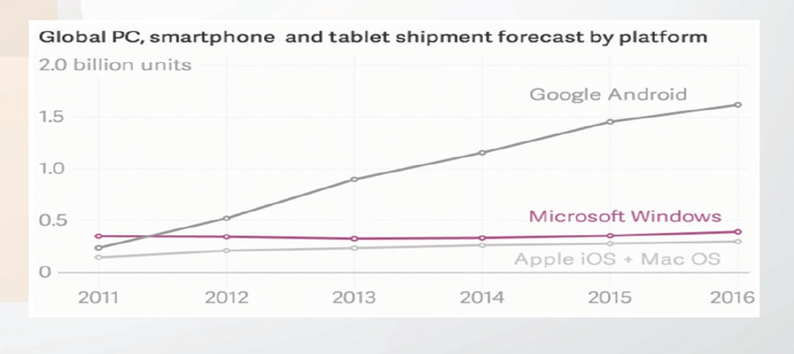
- There are over 1.5 billion mobile web users worldwide and counting.
- In the U.S. alone, more than 25% of Web users are mobile-only, that means that they don’t like, don’t own or simply don’t want to use a desktop or laptop to access the internet.
- Globally, users have downloaded mobile apps over 11 billion times.
- The sale of mobile device globally is also increasingly on the rise, with no signs of slowing down. And according to statistics, over 90% of these mobile devices possess the ability to the mobile Web space.
Problems with Mobile First:
The mobile first approach may not be the best choice if there is a limited budget or a pre-existing site design. Restructuring a website that is already designed and going back to the drawing board to begin with an entirely new process can be costly and it takes a long time. Here are the few drawbacks of mobile first:
- Right from the outset, it hits with constraints like smaller screens, fewer resources and device limitations.
- With a faulty design and less amazing features, losing customers could happen even before acquiring them, therefore constant work in improving the app is needed.
- Rescaling for mobile devices typically generates very long pages requiring lots of scrolling which is a bad mobile user experience.
- Requires the same amount of testing but needs to be done across a lot more devices even when you make an update.
However, these drawbacks should not be the primary focus. Rather, the different needs of the target audience and strategic goals of the website should be at the forefront of all considerations. In fact, web designers and developers alike have been oversimplifying the issue of mobile first since the early 2000s, which has led many to believe that responsive web design is the answer to all of their development woes. Also, it’s possible that the best practices of mobile design will subsume desktop design, bringing simpler and more efficient interfaces to users everywhere.
The Final Verdict:

Typically, a responsive design is structured around the concept of numerous media queries that target certain devices that have specific screen size restraints. And with this information in hand, you can easily create codes for your initial CSS design and then eventually use these media queries to draft additional size support.
And if you think that you can ignore all of this by either maintaining two separate websites, you are gravely mistaken. If you build a separate mobile website by totally avoiding the use of a responsive design, you will end up with two fully-functional websites. This subsequently gives you two entire codebases to design and maintain, doubling your work. Ultimately, it’s best to get over the platform-first approach and embrace the mobile first approach, for your own convenience and the convenience of all your users.