
FlexBox VS Box Model
Flexbox is entirely new collection of CSS properties that lets developers to generate flexible layouts with just few lines of code.
Flexbox reacts same as its name. Flexbox provides block level arrangement of parent and child elements that are flexible to adapt to display size. This is an exciting concept of developing complex block model which lack flexibility especially on large scaled application with orientation changes, resizing, stretching, shrinking. Indeed, lots of developers found Flexbox model easy to use.
The fundamental concept of flex layout is to provide ability to alter its items width and/or height to best fill the available space on any display device. A flex container expands items to fill available free space or shrinks them to prevent overflow. Flexbox property is supported by all latest versions of modern browsers Google Chrome 29.0 +, IE 11, FF 28.0 +, Safari 6.1 & Opera 12.10.
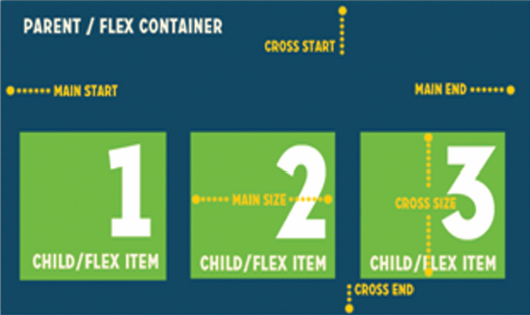
“Flexbox child elements can be positioned in any specific direction and can have flexible dimensions to adjust to the display area. Positioning child elements is thus much easier, and complex layouts can be achieved more simply with cleaner code.“
Now designers can manipulate the direction, alignment, and spacing of page elements with display:flexbox method. Properties such as Display: flex, flex-direction, justify-content flex-grow, etc allows developers to make consistent height for flex items. There are many spacing choices for flex items within the flexbox, both horizontally and vertically.
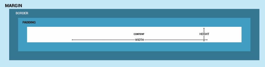
Spotlight on Box Model:
CSS Box Model has important components that essentially wrap the content area in the so-called box. Box Model is made up of 4 distinct parts Content, Padding, Border and Margin that interact with each other to form a box and calculates space of a block-level element that it takes up. Below you can see a schematic view of the CSS Box Model.
Few important properties that you will need for the box model are display: box, box-align, box-pack, box-flex, box-ordinal-group, and box-orient. The CSS3 box-sizing property allows you to specify the box model with values content-box | border-box | inherit. You can specify a border/padding value in relation to a fluid length element with the ‘box-sizing’ property that is supported by all major browsers.
This box model is extremely effective when you have two equal columns. If you provide them 50% width each and add some padding and maybe a border, the columns won’t show up side by side. This is an ideal scenario where you can set box-sizing to border-box and happily set the width to 50% for both boxes.
Now let’s have a look at how they differ:
Flexbox
- It is direction agnostic and is ideally suited for aligning its contents in ways that Web apps and complex Web pages often need. By using flexbox, we can control row widths, column widths and column re-ordering on the screen.
- Most appropriate for the components of an application and small-scale layouts.
- Flexbox is not supported in IE and Safari. They are available in newer versions of Firefox(18.0 -moz) and Opera(12.10) and Chrome (21.0 – webkit). For modern browsers you should get a long way using flexbox standard syntax with the “-webkit-” vendor prefix added in.
- Elements in page behave predictably when accommodating different screen sizes and different display devices.
Works well for responsive websites when combined with other technologies such as Media Queries.
Box model
- It works well for pages by giving basic floating positions, it lacks support to application components that have to change orientation, resize, stretch, or shrink as the user changes, flips from vertical to horizontal, and so forth.
- It is intended for larger scale layouts.
- All major browsers support it, except IE7. Currently, Firefox is the only browser that needs a vendor prefix, so make sure to also include the “-moz-” prefixed declaration.
As you can see, Flexbox has great potential to make our lives so much easier if we need to set up a layout for a website. The bottom line is that both flexbox and box model radically change the way we approach layout and build websites. The properties both of these have flip our CSS approach on its head and makes us consider layout from a logical perspective.